Guests:
Marsha of Marsha Neal Studio
Alison of Alison Adorns
Jess of The Copper Cat
Brooke from Artistic Endeavors
AJE Team:
THANK YOU!
Guests:
Marsha of Marsha Neal Studio
Alison of Alison Adorns
Jess of The Copper Cat
Brooke from Artistic Endeavors
AJE Team:
THANK YOU!
Well another month of Inspired by Reading has come and gone. I got this one on my Nook, but I didn't seem to want to read it. IDK why. Everyone said/says it's good and timeless and interesting. I was rushing to find some inspiration without reading the book (WHAT?!) and I found her NON fiction book online. Here's a link to it. I read about the Yellow Emperor because I did find out that one plays a part in the book. THEN I googled the Yellow Emperor and it is actually called Eacles imperialis. which is now known as the Yellow Imperial. Here is a fantastic photo I found of it to show its size and another to show the purple color!
I also NEEDED to know the differences between moths and butterflies, here's what I found...
So here is my half finished Eacles imperialis!
Take a look at our Facebook page for Inspired by Reading to see what everyone has accomplished and actually finished! I am betting there are a lot of moths!!
This month's Pretty Palette was based more on an idea than a thing. The idea of WabiSabi.
Erin picked out some rusty and worn gears and metal parts as inspiration and used them as the basis for the color palette of copper and turquoise. I found my beads this month at Joann's under the Bliss Beads label by Halcraft. I started with the same color palette. But I wasn't happy...
The photos are taken on a 30 year old wooden chair that my father-in-law made for my husband. It's a re-creation of the chairs that were at the public pool of our town. My husband and I grew up swimming almost daily at the pool in the summer. The chair has been outside in the elements 365 days a year. The chair is worn and weathered and rusty and creaking but it still works. When you sit you are transported to a simpler time.
I sit on it everyday to have my coffee in the morning, outside with my dogs.
Okay, I know I say this for every challenge, but this one is DEFINITELY my favorite BY FAR!
The Beer Label HoneyDo Challenge
Some background: I work in the restaurant industry. I work in a full service family restaurant. We started featuring and highlighting a craft brew or micro brew every week for cheap so people would be more likely to try these interesting brews. We have one on tap and a different one in a bottle. It worked! We upped our beer sales over the last year! Yay! I've seen lots and lots of labels, but the MOST exciting is to see what the tap handles are!
So for this challenge I used the 'just kicked' brew's tap handle, the current brew's tap handle and the 'on deck' brew's tap handle that we had at work. Here they are...
DuClaw Brewing Co of BelAir MD. Kona Brewing Co of Kailua-Kona HI. Blue Point Brewery of Patchogue NY. |
Fun Right!!!
Well, I have two finished. The wizard seems easy, but I am waiting on the perfect wizard focal for him, I'll post when I find it. So here are my other two.
First up Neon Gypsy by DuClaw Brewing:
Next up Koko Brown by Kona Brewing:
Allegory Gallery always has some cool lava rock strands, so I knew I wanted to use those... Then I found some white coral chips and I had some blue cultured sea glass and wooden tube beads. The flower made some changes along the way until I found this laser cut wood flower at Allegory Gallery. Even though there is no bird on the handle, I imagine there are some in Hawaii, ;-) so I had to add a Humblebeads birdie!
Thanks Eric and Sarajo for this challenge! I will be newly inspired weekly by our tap handles at work. Keep your eyes on my blog for the Blue Point wizard to make his debut.
Hop to Sarajo's page to see what everyone else created for the Beer Label HoneyDo Challenge!
What a beautiful kit this was! Taken from Pantone's colors of the season, Andrew picked the blues and tans this time. I think one is actually called Snorkel Blue!
Here is an AMAZING MakuRaku pendant I've been hoarding that I wanted something to help pull out the colors of the bird...
Isn't Raku beautiful! It seems eternally liquid or wet, but that is the way good Raku looks with all the iridescence. I thought this color blue would be a perfect fit. It was, take a look...
I like loved the large hole big blue vintage plastic so much that I bought more from Allegory Gallery along with the green large hole that I found there.
Check out how close this plastic looks to matte stone, it's pretty darn cool!
Please hop along to others through the Facebook page for Allegory Gallery Design Challenges! Check out the diverse creativity that these challenges bring out!
This challenge kit is all about the Pantone colors of the year and blue waters!
This one is all about Craft and Micro Beer labels!
Wabi-Sabi! Finding beauty in imperfection and natural decay. Seeking beauty in the broken, rusty and decayed.
Always based on a piece of artwork. This month it's the abstract piece "Jacob's Ladder" by Helen Frankenthaler.
This challenge always centers around an artist's component, this month it's an amulet vessel.
Book Club + Jewelry Making = awesome fun
This challenge you must use all the colors they post in the palette.
I forgot to post this! I posted on the Inspired by Reading Facebook site, but completely forgot to blog about it!
I had already listened to this book on cd twice. Plus read her first novel The Historian. I loved them. Very long, but keeps your interest. Since it had been a while since I read it, I thought I would do some projects on the IDEAS that she used to tell the story.
Étretat, Normandy Coast, France was called "the beach of artists and writers" in the late nineteenth century. Gustave Courbet, Eugene Boudin, and Claude Monet to name a few.
In the winter of 1868-1869 Monet's attention was drawn to Etretat in the Caux region of Normandy. He then returned there every year between 1883 and 1886. Like many painters, particularly Gustave Courbet, Monet was captivated by the picturesque qualities of the place, and took inspiration from it for more than fifty of his paintings.
The configuration of "these high cliffs pierced by these strange arches called the Gates" (Maupassant, Adieu, 1884) gives an unusual character to the landscape. The largest of the three openings in the cliffs, the Manneporte, "an enormous vault through which a liner could pass" (Maupassant, Guillemot Rock, 1882), appears in only two of Monet's paintings. This work can be dated 1885, by analogy with another painting of equal size, signed and dated 1885: The Manneport, Etretat in the Philadelphia Museum of Art.
I fell in love with this one of the series...
Here are a few more...
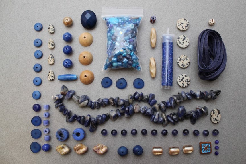
Here's my necklace to represent Monet's cliffs at sunset...
The Leda with the Swan is a DeviantArt piece I found while researching...
September Art Elements Challenge Wow, it’s been a year since I last used the blog. I always liked using my blog instead of Facebook, I act...